Alright, get ready to build some excitement! LEGO is shaking things up with a brand new look. It's not just rearranging the bricks, but the whole new vibe.
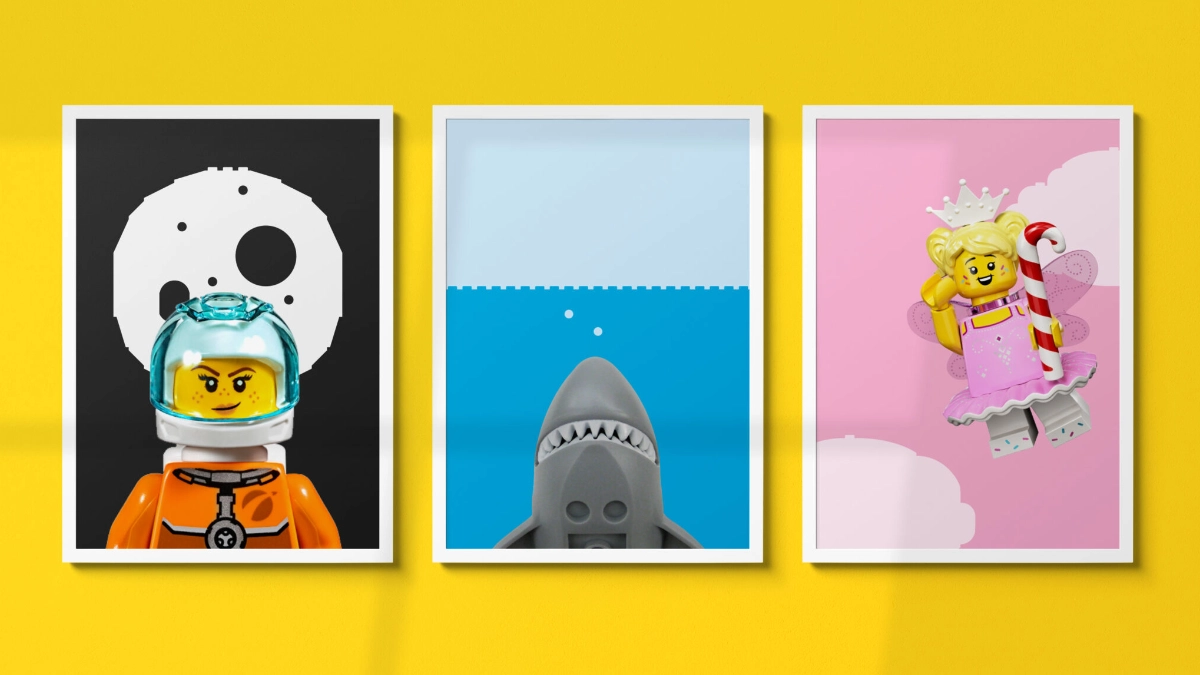
LEGO recently unveiled a vibrant rebrand that aims to deliver a more consistent and cohesive brand experience across all its physical products and digital platforms. The rebrand features refreshed design language and elements that build upon the brand's core mission of creativity, play, and learning.
The LEGO Group partnered with its in-house creative powerhouse, Our LEGO Agency (OLA), along with the renowned design firm Interbrand. Together, they delved into the world of visual storytelling, drawing inspiration from the dynamic semiotics of comic books.
The Clutch System
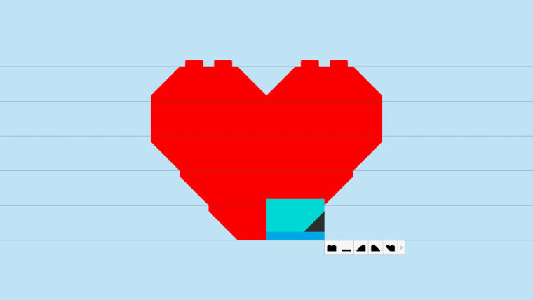
The first brick of the rebrand project was the "clutch system". Interbrand and OLA developed this revolutionary tool dubbed the "clutch system," also known as LEGO Brick Pro. This innovative system allowed the digital replication of LEGO elements by transforming them into a font consisting of 130 glyphs. With this font, users can swiftly construct various elements such as holding shapes, illustrations, and UI buttons, all while adhering to the same geometric principles as traditional LEGO bricks.
For example, check out this heart, made straight out of the shapes and illustrations from this design system:

Build me a font!
Brands love a unique identity. And one of the main building blocks of that is a bespoke font. Many, many brands have ditched common, generic fonts and adopted custom ones. Most recently, TJ Maxx did it by moving away from Helvetica to a custom typeface called "Maxx".
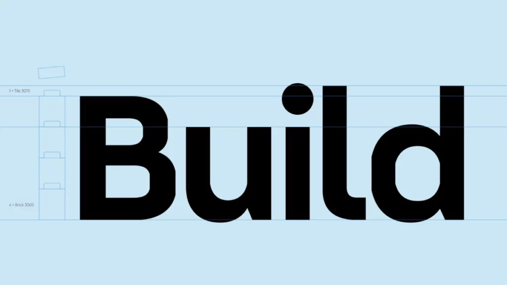
Similarly, LEGO has also unveiled the new LEGO brand typeface – LEGO Typewell®. The bespoke font is built by the popular Colophon Foundry, who has worked on typefaces for brands like Canva and Tripadvisor.
The font is directly inspired by the geometry of the LEGO System-in-Play. And it will be deployed globally across 120 languages, unifying the brand's visual identity. But, as of today, LEGO's app and website have not switched to using the new font.

The Block Motion
This is where the rebrand truly shines. The team cooked up some seriously cool motion principles, inspired by the way people interact with LEGO elements. And it's not just a couple of motion principles being laid out. These are pretty varied ranging from the motion of separating LEGO blocks to the motion of dropping them. They have even embraced how people make mistakes while playing with the blocks.
No principle for stepping on a LEGO though, in case you are wondering.
Quite a brick-by-brick rebranding. According to Thomas Holst Sørensen, global head of design at Our LEGO Agency (OLA), the new brand DNA reflects the core values of the LEGO brand – simplicity, creativity, and endless possibilities.
So, what's next for LEGO's bold new look? The wider design system is set to be rolled out globally across all product ranges and digital platforms, ensuring that every interaction with the LEGO brand is a memorable one.

