TJ Maxx, has moved away from the ubiquitous Helvetica and joined the list of brands adopting their own custom font. In case of TJ Maxx, it now has its own custom typeface called "Maxx".
The new Maxx typeface was developed in collaboration between McCann Design and type expert Jeremy Mickel of MCKL Type Foundry & Design Studio. MCKL is the prolific design studio behind popular custom fonts for brands like Warner Bros. and Fisher Price.
Why ditch Helvetica? Well, firstly, everyone else is using Helvetica. Target, Gap, JC Penney: brands similar to TJ Maxx use Helvetica. Every branding needs targeted love and care. "We needed something different. Anything we tried in Helvetica reminded us of other brands", explained Matt van Leeuwen, head of design at McCann. Having a bespoke, custom font designed specifically to cater the needs of a brand, always helps a brand stand out.
TJ Maxx has an iconic logo. And the design team drew inspiration from the unique letter shapes in TJ Maxx's existing logo without straying away too far from it. It is very important for designers and branding studios to understand the delicate nature of rebranding, especially for brands that have a generational identity and nostalgia associated with them. A rebrand does not have to be an overhaul.
The Maxx font is proprietary and not available for public usage, obviously. But, many of the details for the font are available from McCann Design and some press coverage. Let's dive into some the details.
Circular all the way
Maxx is a premium geometric typeface. The circular shape stands out and is heavily relied upon. It's not just the usual round characters (like "o" and "e"), but others like "m" and "u" that also embrace the circular construction, completely skipping the need for a vertical stem.
Geometric typefaces are not new to the type industry. Originally popular in the 1920s and 1930s, they've gained a new-found popularity in the recent years. Examples include Monotype's Century Gothic, Google's Product Sans and Tall Chai's in-house Brahma font that is used on this very website. Before designing Maxx, MCKL Type Studio has also designed similar geometric fonts for Uber and Adidas.
Sturdy weights
Based on the campaign and the promotion, Maxx is designed to be used for headlines, campaign titles and other display type usages. It is not a text type, and will most likely not be loaded or used to style any rendered text for digital usages (like on the website or the app).
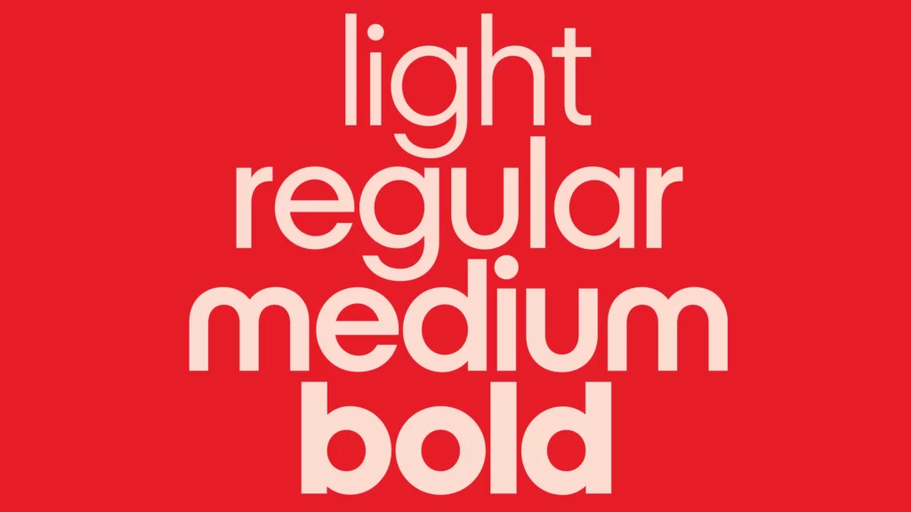
Display fonts like Maxx do not have any solid motivation to be OpenType variable fonts. In fact, in some cases, variable fonts may have to compromise on the design in order to keep the glyph nodes and weight dimensions consistent. The non-variable Maxx font has four individual weights: light, regular, medium, and bold.

Maxx font weights. © McCann Design, 2024.
Ligatures that stand out
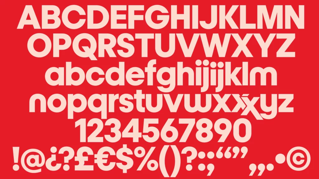
Perhaps the most distinct feature of the Maxx font is the stylistic ligature of "xx" that mimics the TJ Maxx logo. This is where the font truly shines as a custom type. Typing two x's together will open up the OpenType feature. It is not clear if it is a contextual alternate, that needs to be explicitly activated or a standard ligature that is implicitly available when you type "xx".
Another contextual alternate available is a shorter, reduced x-height for "ij". This is seemingly to provide a more compact space setting for display.

Maxx character set. © McCann Design, 2024.
The Maxx font is a contemporary, opentype, customized take on the classic, geometric typefaces. TJ Maxx has jumped on an opportunity, that some other companies (cough, HBO Max, cough) have missed out on when it comes to giving a brand a well-designed refresher.

